

During all of the hard work from agencies and brands when creating a promotion, what is incredibly important to consider is grabbing the attention of consumers in store, who hopefully go on to purchase. The consumers need to be hooked in from first sight and that usually happens by brands going the extra mile with their on-pack design and in-store activation support.
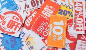
Naturally what catches our eye as humans are bright colours, quirky designs and just something that is ‘out of the ordinary’. We’re all in shops each week, sometimes every day, looking at the same products – so an extra bright, different design appearing on the outer packaging will usually make anyone double-take. These are personally the promotions that disrupt my shopping behaviour, even before I’ve seen the prize or the mechanic. I took myself off to a couple of supermarkets in August and had a nosey around at what promotions are on shelves at the moment to see which on-pack designs, shelf displays and off-fixture POS stood out.
Here are the top 3 promotions I found:
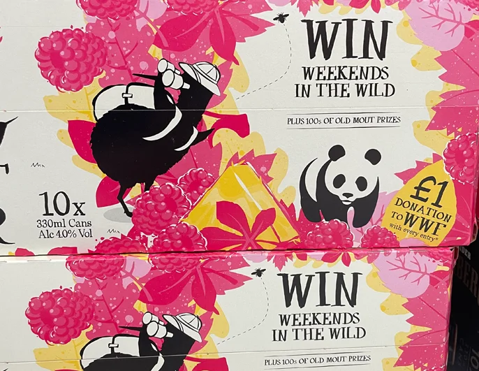
OLD MOUT CIDER – WIN WEEKENDS IN THE WILD
Just look at it. What a beautiful pack of bright colours and a fab use of their instantly recognisable Kiwi Bird and fruit flavours – in this case, raspberry and pineapple. Most people will have known they’ve partnered with WWF for a long time now and they’ve even used the iconic Panda in their design too. It’s such an adorable and clever safari scene. After appreciating the beauty of the colours, I knew instantly what the prize was without reading the title and I was SOLD at first look.
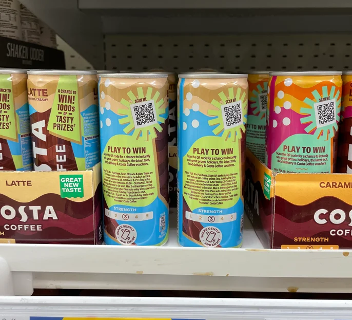
COSTA COFFEE – A CHANCE TO WIN 1000s OF PRIZES
This is a fabulous example of a product which doesn’t have loads of space to communicate on-pack but they still thought ‘let’s go for it’. The can is almost entirely covered with the brightly coloured promotion design and the pay-off is great. You literally cannot miss the promotion on the cans, even when it’s amongst its competitors, and they look so fun! The mix of colour palettes, depending on the flavour of iced coffee, add its own uniqueness but are so complimentary to the Costa Coffee logo. If I drank coffee (I know – I’m shocked I still don’t either) I would have been convinced to grab more flavours just to have the cute cans and therefore more entries in to the promotion. To read more on the promotion, click here.
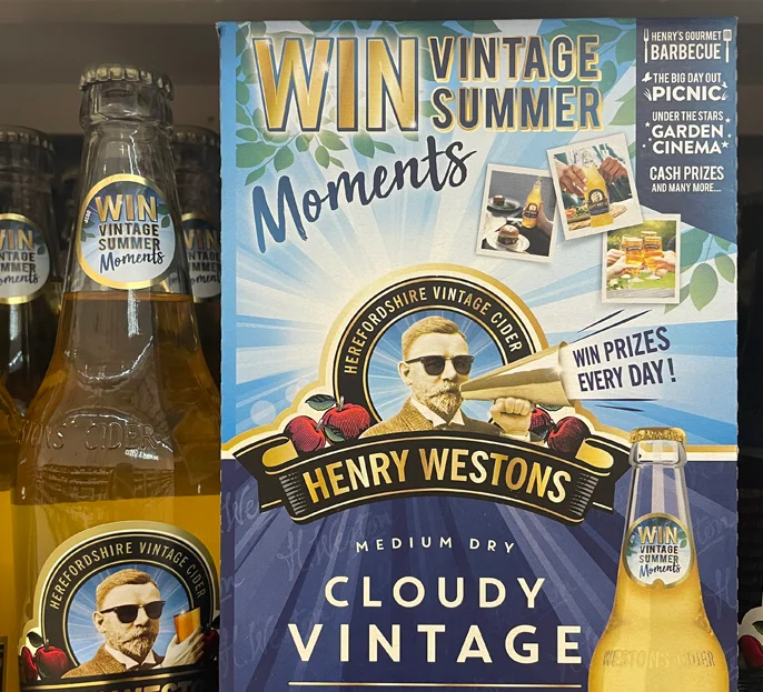
HENRY WESTONS – WIN VINTAGE SUMMER MOMENTS
For what I think would be considered as quite an average cider logo, Henry Westons have not been afraid to manipulate it and also the image of Henry himself. They’ve added a pair of sunglasses for the summer vibes and a hand holding a mega phone shouting ‘Win Prizes Every Day!’ – love it. It’s still very much complimentary to their brand, sticking to the colour palette and even making the extra features feel a part of the logo, but they’ve not been afraid to make it lighthearted and fun. Then beautifully partnered with another on-brand ‘WIN’ headline and extra summery images of people holding the cider, instantly make it relatable. Bravo Henry Westons! To read more on the promotion, click here.
I have to say, alcohol brands, especially cider it seems, are killing the game. Albeit, when I was comparing to the other promotions, I do understand they have a lot more space to be playful on with their design, but I have to hand it to them, they really are utilising what they have and going for it. Especially when you compare to Heinz who have tried to keep on-brand so much with their promotional packs that they’ve achieved such a tiny and unnoticeable headline lock-up and it looks like an afterthought. I almost missed the fact they had a promotion on. I’d love to give an honourable mention to both Weetabix for their disruptive POS (the goal post stands) and Arla with their Big Milk bottles having The Gruffalo partnership branding takeover their entire label – that’s how you grab the attention of your target audience.
Promotions are a brilliant way to create consumer excitement over your brand and since I’ve worked at Mando, I know the hard work that goes into each one behind the scenes. When developing your next on-pack promotion, spend as much time and attention as possible to the front of pack creative.
Don’t be afraid to use some bold and risky colours and designs which attract consumers in at first sight from across the shop aisle! They’ll be right over.


